|
INTRODUCTION TO COLOR GUIDELINES AND STANDARDS This section of the website includes several kinds of information about color guidelines and standards:
Generic
Guidelines and Standards Specific color guidelines and standards all differ with respect to the exact wording of their requirements, but the graphic problems that they address have a lot of overlap. Most fall into three general categories: discrimination and identification; luminance contrast; and general problems of color design. These
pages include our generic restatements of specific color guidelines and standards
that we have reviewed, with illustrations and links to the related information
in our website: About Color Guidelines
and Standards In this section we briefly discuss some of the reasons why we have guidelines and standards. We also discuss and illustrate some problems of guidelines and standards as a means for assurance of quality of color usage, and suggest some research directions toward solving the problems. Specific
Color Guidelines and Standards This page includes a listing
of aerospace and non-aerospace guidelines and standards that include color usage
issues. ABOUT
COLOR GUIDELINES AND STANDARDS Why do we need Color Guidelines and Standards? The consequences of poor color design are minimal in some applications (e.g., personal webpages), but in others the consequences can be life-threatening (e.g., flight critical displays in cockpits, air traffic control displays, launch-control displays). When poor design has important costs, the community needs some means of assuring sufficient usability and conformity to conventions. The only reliable way to assure quality of color design is to ensure that human factors engineering is properly integrated into the design, development and testing of the product that gets deployed. This requires that:
In this process color guidelines can provide the human factors professionals with a checklist of the important usability concerns related to color. They can also be used to focus interactions with color consultants. For applications that involve public safety there is sometimes another role for standards. Standards can represent community agreement on uniform practices where they are needed. Universal use of green, yellow or amber, and red to label safety status, for example, allows users to understand their meaning in multiple environments with minimal need for training. Proper integration of human factors expertise has not happened on some projects, for a variety of cultural and practical reasons. In lieu of that expensive process, color guidelines and standards are sometimes expected to provide a human factors shortcut, i.e., to allow graphics developers and design reviewers with limited knowledge of applied color science to avoid serious mistakes in color design. That's too much to expect from any document, regardless of size and quality. Color perception is complicated. Perception of even simple patterns in the laboratory is only partly understood by color scientists. Color perception in natural work environments is far more complicated and less understood, and information displays continue to get more complex. It's unreasonable to expect that any short training course or guidelines document can replace years of specialized professional training and experience in applied color perception, color science and color design. The Status of Existing Color Guidelines and Standards The degree of difficulty in getting effective colors for information display depends on the complexity of the graphics. Until recently most data displays in military and domestic command and control applications were very simple. When display quality, computational power, and communication bandwidth were expensive and scarce, the displays were usually limited to stroke and alphanumeric graphics on uniform backgrounds. For such simple displays it may be possible to describe most of the likely serious color design errors with a reasonably compact set of standards. This situation has changed dramatically over the past several years. Inexpensive display systems are now capable of routinely computing, transmitting, and displaying graphics as complicated as dynamic maps, photos, and video. Products with advanced graphics are now commonplace in office and home environments. These capabilities are starting to appear in command and control applications--in cars, planes and industrial control settings where public safety is an issue. To safely exploit the full potential of these new capabilities we will need to adjust our approach to color standards. Conventional color standards are limited with respect to complicated graphics. Most suffer from either vagueness or over-restriction: Some set desirable usability goals but are too abstract to provide useful guidance to designers with limited applied color training and experience. For example:
These "performance-based" guidelines set excellent goals, but how are they to be achieved? Other standards place constraints on specific graphic elements. These often set parametric requirements that can be verified by eye or instrument. For example:
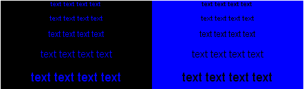
These are more easily verified, but are generally too simple and rigid to allow optimal design solutions in complicated graphic contexts. For example, if all graphic elements are required to have high luminance contrast the information density that can be achieved is unnecessarily limited by the resulting clutter. Another example is use of blue:
The blue/black combinations in the two panels above are difficult to read, especially at the smallest sizes.
When there is sufficient luminance
contrast, however, as in the above blue/white panels, blue is a usable label color
even at the smallest font sizes. There are also several other ways to make blue usable
as a label in complex graphics. Possible Improvements Guidelines and standards cannot replace properly trained and experienced human factors experts. Nevertheless, they might contribute to better design if the above limitations could be overcome. One possible answer is to state the requirements in terms of the performance goals (e.g., legibility, discriminability, recognition), but then to go on to provide standard advice and methods for meeting the goals. It's a topic for research at this point whether and how this second part might be achieved. One possible approach would be
to construct a hierarchy of guidelines, beginning with high-level
performance goals at the top level and proceeding down to more
specific guidelines about graphic elements. We have developed a
prototype hierarchy here: This website is part of a project investigating how such a system of quality assurance might be developed. The site is not itself intended to be a substitute for a standards document but to explore and demonstrate potential of web resources that might eventually be used in such a site. By exploiting the capabilities of the web it may be possible to state a requirement in the form of a performance goal, demonstrate successful and unsuccessful examples, and point designers to information about related color science and color design that could help them find a solution for their own specific application. Related Topics:
|