|
| INDIVIDUAL DIFFERENCES IN COLOR VISION
This page includes introductory information on incidence of deficient
color vision, non-technical and technical descriptions of color vision
deficiencies, and color design for color-deficient users. The design strategies and tools described elsewhere in this site are based on an assumption that the users' color vision is "normal". That assumption has enormous advantages, such as being able to use tools based on the CIE Standard Observer model, including the automated color selection tools of this site. This is a reasonable assumption for more than 95 percent of the general population. However, about eight percent of the male population have color discrimination capabilities that are not well described by "normal" color vision models. There are varying degrees and kinds of color discrimination deficiency ranging from slight anomalies to full dichromacy ("color blindness"). All of them can be characterized as a tendency to confuse groups of colors that are clearly distinguishable by the color-normal observer. Color-normal observers make color discriminations in a three dimensional color space consisting of two "chromatic" dimensions ("red/green" and "yellow/blue"), and brightness. Color deficients have reduced ability to discriminate colors along one of the two chromatic dimensions. Dichromats can discriminate colors in just two dimensions (the other chromatic dimension and brightness). Types
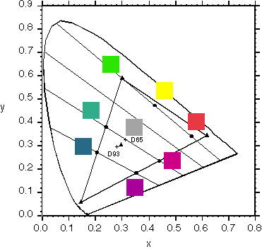
and Incidence of Deficient Color Vision Color vision deficiencies can be characterized by the classes of colors that are confused. There are three main classes of deficiency that are commonly identified: 1) Red/green deficiencies are by far the most common (about 8% of the male population). There are two types of red/green deficiencies, protanopes (and protanomalous) and deuteranopes (and deuteranomalous). Protanopes and deuteranopes are unable to distinguish among large classes of colors that color normals can easily discriminate. Protanomalous and deuteranomalous users can make more distinctions than protanopes and deuteranopes, but they require larger color differences for some discriminations than color-normals. Red/green deficiencies occur sufficiently often to require consideration by the color designer. In color vision testing red/green deficient users confuse colors that lie along lines passing through one of two points near the red end of the spectrum locus in the CIE xy diagram. When adjusted to the same brightness, pairs of colors on one of these lines will be indistinguishable to a red/green deficient user. To a color-normal observer these colors appear to have different amounts of red or green in their hues. Red/green deficient users are similar to normals in their ability to distinguish between pairs of colors that differ in the amount of blue or yellow that they contain. Protanopes' confusion lines converge at a point at the red end (right end) of the spectrum locus. Reds also appear darker to protonopes than to normals.
Deuteranopes' confusion lines run through an extraspectral point (off the chart to the lower right, in these coordinates) and their brightness vision is more like that of color-normals.
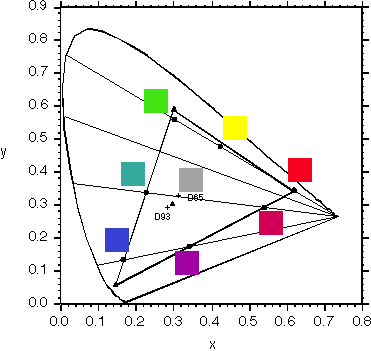
The confusion lines illustrate an extremely important point about the name "red/green deficient". Don't be misled by the name. While it is certainly true that protanopes and deuteranopes have a confusion line running through reds, yellows, and greens, indicating their difficulty discriminating reds from yellows and greens, their problems are not limited to reds, yellows and greens. Their other confusion lines span the entire color gamut. For example, they also have difficulty discriminating blue-greens from gray and magenta. We will return to this point below when we consider color designs for mixed user populations. 2) Tritanopia and tritanomaly are yellow/blue deficiencies. Tritanopes are very rare (about 0.005% of the European population) and thus require no special consideration in most color designs. Tritanopes confuse colors (of the same brightness) that lie along lines passing through a point near the blue end of the spectrum locus in the xy diagram. These colors contain different amounts of yellow or blue for a color normal observer. Tritanopes can distinguish colors that differ along the red/green confusion lines, i.e., colors that contain different amounts of red or green for a color normal observer. 3) The third class, achromacy, is also very rare (less than 0.005% of the European population) and can generally be ignored by the color designer. These observers confuse all colors that have the same brightness. Practical Implications. The potential impact of color deficiencies can be illustrated by looking at some of the colors that are confused by red/green dichromats. In the diagram for deuteranopes below we've chosen as the topmost confusion line the one that passes through the green primary of our SONY monitor. This line passes through yellows and reds, running near the most saturated yellow and red of the monitor. If adjusted to the same brightness all of these colors will look the same to a deuteranope. The top confusion line in the protanope figure also passes through red, yellow, and green.
This implies that conventional green-yellow-red safety labels, unless very carefully chosen, would be discriminable by some red/green dichromats only on the basis of brightness differences. Users with lesser defects would still have reduced discrimination along this axis. Protanopes potentially have a second problem with conventional safety signals; the brightness of reds is reduced for protanopes, reducing their salience in some contexts. Other colors will also be confused by dichromatic users. Confusion lines span the entire color gamut, i.e., all colors in the visual gamut lie on one or another confusion line and will be indistinguishable from others on that line if their brightnesses are equal. While not as critical as confusions of safety codes, two other popular labeling colors, cyan and magenta, lie near a deuteranopic confusion line, posing possible efficiency or even safety problems. The color sets below lie on deuteranopic confusion lines when displayed on our SONY CRT monitor. The colors within Sets A and B in the left panel would be distinguishable by most deuteranopes only on the basis of brightness. The symbols in the right panel could be discriminated by shape and brightness but not by color.
Caveats. The foregoing discussion accurately illustrates the general issues of color deficiencies, but it has been kept simple for clarity of presentation. Several complications should be kept in mind regarding displays in natural settings: - The described confusions are those that occur under laboratory and testing conditions, i.e., the lights to be discriminated are small and centrally-fixated, and other variables are carefully controlled. With respect to more natural situations dichromats have had a lifetime of experience with colored objects and are accustomed to taking advantage when possible of other bases for discrimination when their color discrimination is unreliable. - The descriptions of dichromatic color confusions above are averages across individual observers. Individuals vary in the color separations required for discriminations along the confusion lines, and their confusion lines can be slightly curved. Color Deficiency in the Workplace For those and other reasons decisions about applications for user populations including dichromats require very careful consideration and expert analysis. In spite of the above caveats, there is broad support for limiting participation by color deficients in some occupations:
Commercial airline pilots and air traffic controllers are among the "occupations known to apply a colour vision standard." Birch, p. 135, Table 11.1. The CIE has recommended an international set of requirements for transport workers. In the US the FAA is studying the existing color vision requirements for air traffic controllers in light of increasing use of color displays in ATC facilities. Pilot color vision testing and some airport signal systems are getting increased attention following an NTSB finding that a pilot's color vision deficiency contributed to a 2002 crash at Tallahassee, FL. NTSB Report Designing for Populations that Include Users with Deficient Color Vision If the user population includes any color-deficient users, they need to be taken into account in the design of graphics:
Before looking at designs that allow dichromats to make the necessary distinctions we need to consider how the display will be used by normal and color-deficient users. If the same display will be simultaneously viewed by both normal and deficient observers then a single color design must allow satisfactory performance by both. The same applies if the users have their own private displays but must refer to the colors of graphic objects in discussions. If neither is true then it may be possible to safely give the user a choice of several color designs, one for normal trichromats and the others for dichromats. That said, it will likely be more difficult but safer and cheaper to develop a single design that is safe and efficient for both normals and color deficients. How can color coding be made usable by dichromats? Two obvious design strategies are: 1) Limit the colors that must be discriminated to those that are discriminable by red/green dichromats (and normals). This will require that the coding colors differ sufficiently in luminance, yellow/blue content, or both. In the simplest cases, those in which there are only a few classes of graphic elements to be labeled, the solution may be as simple as giving the color codes different brightnesses by altering their luminances. However, brightness coding is very limited. In most contexts only only a few distinct levels can be reliably identified, and brightness coding renders manipulation of luminance contrast for other purposes difficult if not impossible. When there are many graphic elements and classes of elements we have to use differences in yellow/blue content. This is accomplished by choosing coding colors that lie on different (sufficiently separated) confusion lines of red/green dichromats. The most obvious candidates are gray plus various saturations of blue and yellow. There are problems with restricting coding to only these colors. Only a few saturations of each hue are easily discriminated, and schemes that include only yellows, blues and grays appear muted to the trichromatic users. However, coding colors need not be restricted to those containing no red or green. Any color along a confusion line can be chosen so long as any others on the same confusion line have distinctly different brightnesses. Careful choices should be able to preserve for the trichromatic users many features of conventional graphics while accommodating dichromatic users. Brewer and her colleagues have developed several coding schemes for cartographic data that are discriminable by populations including red/green dichromats. Some of the schemes include only yellows, blues and grays but others use colors from other parts of color space. 2) Use a second, redundant graphic dimension along with the color code. Position, symbol shape, font variation, and texture are some of the possible redundant dimensions that can be combined with color. Stop signs, for example are distinct in both shape and color from other warning signs. Traffic lights can be discriminated on the basis of position as well as color. For complicated graphics like maps
or air traffic displays this strategy is easier said than done. In such applications
the best candidates for the second coding dimension are usually
already assigned other independent coding roles. Furthermore, if
a color-coded caution and alerting system is required the redundant code must have the
same salience and "popout" capabilities that saturated red or yellow have for normal trichromats. To achieve this with a non-color dimension would probably require at least mild temporal modulation, which has its own drawbacks.
Related Topics:
|