To Skip Navigation Press Enter.Link to the Color Usage Site Home Page
Use the category links below to navigate this web site. All site pages can also be accessed with the site map.
Design Process Color Graphics Topics Color Guidelines Aerospace
Color Science Utilities Site Map
Link back to the CURL Home Page

ATTENTION MANAGEMENT

On This Page:  • Maximums are not always the right answer   • Clutter Strategies   • Grouping data with color doesn't necessarily reduce clutter 
• Good design can direct the users' attention

 
Users' attention span often can't cover all of the information that modern display systems are capable of presenting. Designers can maximize the usability of the displayed information by directing the users' attention to the highest priority data. This page discusses some of the relevant concepts involved in attention management.
 
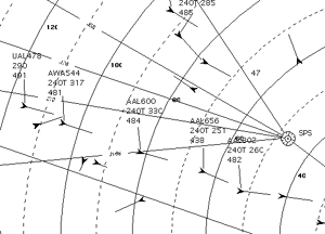
Section of an air traffic control display, showing aircraft symbols, and airspace features (ranges, navigation fixes, etc.). All of the symbols are black against the white background, producing a cluttered display. Maximum legibility and maximum luminance contrast aren't always the right answer. Back to the top of the page.

High luminance contrast is essential for high legibility , but guidelines requiring that all text and symbols have maximum luminance contrast restrict the designers options for good attention management.

In this display the important, dynamic aircraft data are not visually distinguished from the contextual information.

Clutter strategies. Back to the top of the page.

The term "cluttered" is often applied to displays in which the user has to extract the urgent information from a mix with visually prominent but less immediately relevant data. When there are clutter problems with a graphic, the designer has several options:

One can reduce the amount of simultaneously displayed data through filtering and paging. These may be appropriate for separating logically unrelated data, but for data relevant to the current task they should be adopted only as a last resort. They increase the users' workload and introduce opportunities for error, requiring mental integration of the information across displays and display manipulation.

Alternatively one can reduce the density of symbols by increasing the scale of the graphic. In most cases there is a fixed window size for the graphic, so increasing the scale means showing only part of the original graphic at a time. To see all of the original graphic the user must move the window over the desired portion of the original. This navigation can range from effortless to impossible, depending on the users' tasks and viewing conditions, the available interaction equipment, and the quality of the interface design.

Attention management strategies should be exhausted first. A good graphic design can greatly increase the amount of information that can be displayed without clutter problems by imposing order on the graphic elements.

Section of an air traffic control display, showing aircraft symbols, and airspace features (ranges, navigation fixes, etc.). The symbols for different data elements are red, blue, green and black against the white background. All have the same salience, producing a cluttered display.
Larger Image New Window. 


Grouping data with color doesn't necessarily reduce clutter
Back to the top of the page.
Here highly saturated color has been used to identify reasonable categories, but it's overused, with no distinction between urgent information and context.


Good design can direct the users' attention.
Back to the top of the page.
Here the context information has been kept but is less distracting in grays with lower brightness-contrasts. This allows the urgent information, in higher brightness-contrasts to stand out appropriately.
Section of an air traffic control display, showing aircraft symbols, and airspace features (ranges, navigation fixes, etc.). Less urgent symbols have reduced luminance contrast. More urgent have higher luminance contrast attracting the users' attention.
Larger Image New Window.

Related Topics:
go to this page Designing a Color Graphics Page Checklist
go to this page Grouping with Color
go to this page Labeling with Color
go to this page Color and Popout


About This Site

Home
| Design Process | Color Graphics Topics | Color Tool | Guidelines | Aerospace | Color Science | Utilities

  Site Curator: Richard Mogford | Responsible NASA Official: Richard Mogford | Privacy Statement


NASA Logo     Ames Research Center Logo     Human Systems Integration Division Logo