| COLOR
IN AVIATION MAPS AND CHARTS
On This Page: •
Monochromatic Charts • Multicolor
Charts
This page
discusses how color is used in existing paper maps and charts for aviation and some
of the issues in adapting them for electronic display.
Maps
and charts are
particularly interesting as a resource for study of color usage in
information
displays due to the age of the medium. Cartographers have an extensive
historical practice to draw upon, and the best modern maps are highly
evolved. While some of this color expertise is explicitly available
in cartography textbooks, other aspects are implicit in successful
modern maps.
Aviation charts
have very high data densities, and most are intended for use by pilots
while airborne, often in single pilot aircraft. Safety considerations
and high cognitive workload make excellence in design a requirement rather
than a luxury. Many of today's paper charts and maps are remarkably complicated
and approach the limits of the medium. Efforts are well underway to replace
the paper in the cockpit with electronic versions. The different capabilities
of printed paper and current electronic displays will require some redesign
of the graphic content.
Multicolor
Charts 
Multicolor charts
and maps are also in widespread use in aerospace applications. In
the
simpler designs many charts use chromatic color for grouping,
labeling, and popout
of symbols. In more complex designs, some charts also use chromatic
color for labeling of several altitudes of terrain. In the most complicated
area and sectional charts color-labeled symbology is superimposed
on
multicolored
shaded terrain. The shaded backgrounds use most of the available luminance
range of the medium, making addition of any further data a design
challenge.
| Arrival
Chart: This is a sample from an arrival chart for an airport
in the Rocky Mountains. The design codes five levels of terrain
by varying saturations
and lightnesses of tan. The important navigation symbology is printed
in dark colors, giving it high luminance-contrast (and high
salience)
against the light colors of the terrain data.
Font size and style are also used to manipulate saliency and
labeling. |
![Closeup of an multicolor arrival chart for a Rocky Mountain airport]() Larger
Image
Larger
Image 
|
![Sample from the NOAA San Francisco sectional chart]() Larger
Image
Larger
Image |
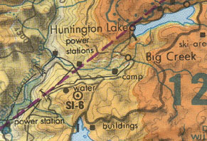
Sectional
Chart: This is a sample from the NOAA San Francisco sectional
chart. These remarkable charts have very high data densities, probably
approaching the limit for use in the cockpit.
Color
is just one of several graphic variables used to achieve the visual
hierarchy of the information. The color design restricts the area variables
(terrain elevation, water) to a narrow range of high lightnesses by assigning
them unsaturated colors. Lines, symbols,
and alphanumerics are assigned darker colors, with more important
information at higher luminance contrasts. Further distinctions
among the high luminance contrast data are achieved by varying symbol sizes
and stroke widths. |
Limits of area data coloring. In this magnified (2.7:1 on an
87 dpi display) detail from the San Francisco Regional Chart the
terrain slopes gradually and the altitudes are moderate.
Consequently the shading and color
labeling remain fairly light. This gives the black text high enough
luminance contrast to be quite legible. |
|
| ![Magnified detail from the San Francisco Regional Chart]()
|
|
In this second detail (same magnification) from another region of the same chart
the color labeling and shading of the terrain are darker
due to the
higher altitudes and slopes. Even at this magnified size the black text is
harder to read. Note the subtle text outlining; the shading
is turned off in the vicinity of the lettering.
The
symbols and alphanumerics would be more legible if the outlining
were lighter.
Better still, the luminance contrast of the terrain-color /
3D-shading scheme could be reduced by using paler colors. Even
very pale shading can give a strong
3D impression.
More
about outlining in Last Resorts.
|
 |
|
|
|
